Webeesocial

The Ultimate Guide to Optimizing Your Shopify Store for Mobile Users

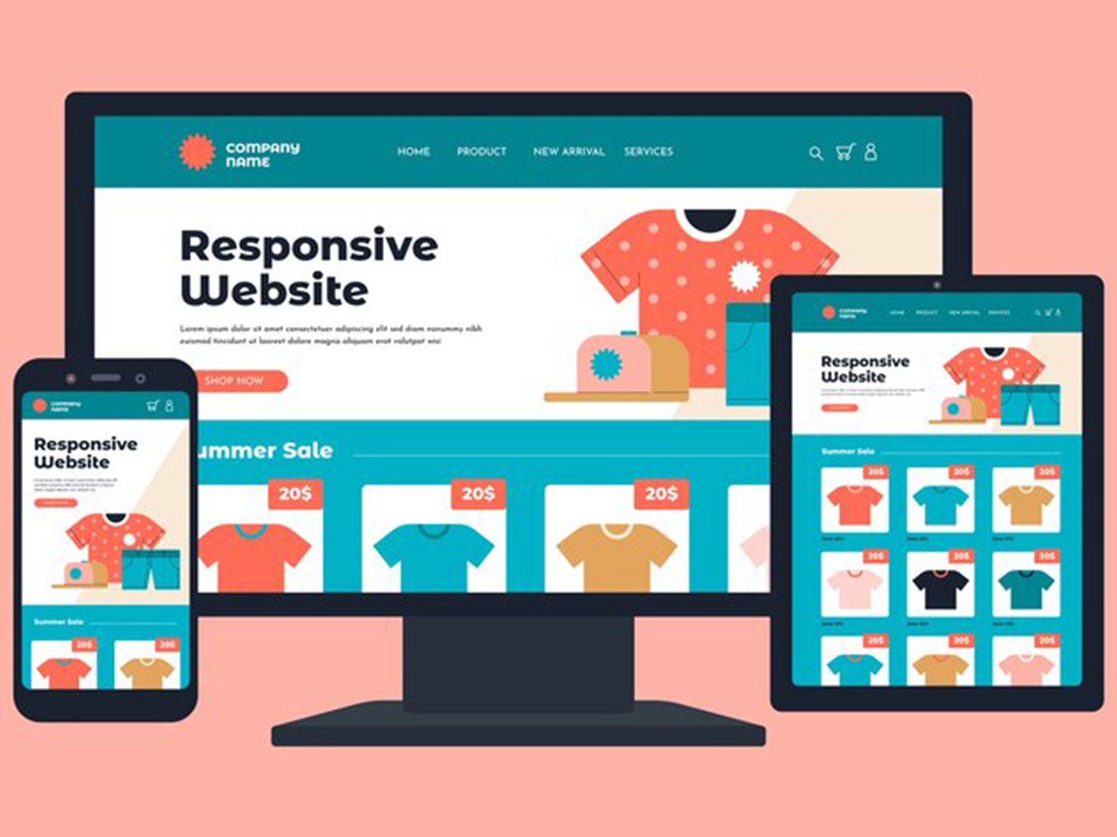
We’re a generation that thrives on movement. Between juggling busy schedules, navigating the TTC at rush hour (bless its chaotic heart), and, okay, maybe spending a tad too much time glued to our phones, we’re a mobile-first kind of crowd. And guess what? That goes for shopping too. Studies show a massive chunk of online sales now happen on mobile devices. So, if your Shopify store isn’t mobile-friendly, you’re missing out on a ton of potential customers.
But fear not, fellow Toronto entrepreneurs! This guide is your roadmap to Shopify mobile optimization. We’ll break down key strategies to ensure your store offers a seamless experience for mobile shoppers, keeping them engaged and turning those clicks into sales.
people-working
shopping

Speed Demons Welcome (Especially on Mobile)

Imagine this: you’re on your lunch break, craving the perfect pair of locally-made Toronto mittens (because, let’s face it, winter can be a real beast). You land on a Shopify store, but…it takes forever to load. Frustration sets in, and you tap away, vowing to find those mittens elsewhere. Speed is king (and queen) on mobile. A slow loading time can lead to abandoned carts and lost sales. Here’s how to make your Shopify store a mobile speedster:
● Top-Tier Hosting
Invest in a reliable hosting plan built for the demands of e-commerce. A good hosting provider can make a world of difference in your store’s speed.
● Image Optimization
Those big, beautiful images? They can also be major culprits behind slow loading times. Use tools to compress them without sacrificing quality.
● Code Clean Up
Minifying code involves removing unnecessary characters from your website’s code, making it leaner and faster to load. Think of it as putting your website on a healthy mobile diet.

Navigation Needs to Be a Breeze

Have you ever tried navigating the TTC during rush hour? It can feel like a maze! Your mobile store’s navigation should be the opposite: clear, concise, and easy to navigate with just a thumb. Here are some tips:
● Simple Menus
Invest in a reliable hosting plan built for the demands of e-commerce. A good hosting provider can make a world of difference in your store’s speed.
● Big, Easy-to-Tap Buttons
Make sure your buttons are large enough for easy tapping, especially on smaller screens. No one wants to play “hunt the button” on their phone.
● Search Bar Savvy
A prominent search bar allows users to quickly find what they’re looking for, avoiding the frustration of endless scrolling.
responsive

Product Pages: A Mobile Masterpiece

Your product pages are your virtual shop window, enticing Toronto shoppers to add those mittens (or whatever you’re selling) to their carts. Here’s how to optimize them for mobile:
● High-Quality Product Images
People shop with their eyes first, so high-quality product images are essential. Include multiple images from different angles and close-ups to give customers a good sense of what they’re buying.
● Compelling Content (Keep it Short!)
Mobile users don’t have the patience for long-winded descriptions. Keep your product descriptions clear, informative, and engaging. Think punchy and persuasive over lengthy novels.
● Mobile-Friendly Reviews
Social proof is powerful. Make sure product reviews are easy to read and navigate on mobile devices.

Checkout Breeze: Frictionless and Fast

The checkout process should be like a walk in the park, not a trek up the CN Tower (though that view is pretty amazing). Here’s how to make mobile checkout a breeze:
● Guest Checkout Option
Allow users to checkout as guests, eliminating the need to create an account during the purchase process. Convenience is key!
● Autofill Magic
Make life easier for your customers by integrating autofill options for addresses and payment information. No more struggling to remember those long credit card numbers on a tiny screen.
● Multiple Payment Options
Offer a variety of popular payment options, including mobile wallets like Apple Pay and Google Pay, to cater to different preferences.

Optimizing for Success: A Never-Ending Journey

Mobile commerce is constantly evolving, so your Shopify store optimization efforts should be too. Here are some additional tips:
● Test, Test, Test
Regularly test your store on different mobile devices to identify and fix any usability issues.
● Mobile Analytics Makeover
Use Shopify analytics tools to track user behavior and identify areas for improvement. Data is your friend!
● Stay in the Know
Keep up-to-date with the latest trends and best practices in mobile commerce.
Optimizing your Shopify store for mobile users can feel overwhelming, but you don’t have to go it alone! WeBeeSocial, a leading Shopify development agency here in Toronto, can be your partner in mobile mastery. WeBeeSocial understands the unique needs of Toronto businesses and shoppers. We’re passionate about helping you leverage the power of mobile commerce to reach a wider audience and boost your sales.

eady to take your Shopify store to the next level?

Contact WeBeeSocial today for a free consultation. Let’s work together to create a mobile-friendly storefront that converts Toronto shoppers into loyal customers! Visit our website to learn more about our Shopify development services.