If your website was a person, your copy would be its voice. Not the layout, not the
fonts, not even that fancy loading animation. Just the words. And if those words sound like corporate gobbledygook
or read like a template from 2014, we need to talk. Because in 2025, your homepage has 8 seconds to impress before
visitors bounce to your competitor. And guess what? They probably hired a sharper website design company in
Canada.
Let’s fix that voice of yours. Here are five copywriting tips that will polish your website content without sending you down a rabbit hole of brand books and buzzwords.
1. Write Like a Human, Not a Pitch Deck
The biggest red flag on a website is when the About Us page sounds like it was written by an intern with ChatGPT set to “corporate overlord mode.” You’re not “redefining innovative synergies in the digital ecosystem.” You’re a business solving real problems. So say that. Imagine explaining your service to a friend who’s not in the industry. That’s the tone you want. Clean. Simple. No jargon. If your sentence needs a glossary, rewrite it.


2. Headlines Are Not Just Titles, They’re Traps
Every section on your website should start with a headline that makes people stop scrolling. It’s not just for SEO, it’s for survival. If your H1 says “Welcome to Our Website,” please shut your laptop and go for a walk. Headlines should provoke curiosity or instantly communicate value.
For example, “Boost Your Online Sales in 30 Days” hits harder than “Our Services.” You’ve got seconds to win attention. Make it count.
3. Stop Talking About Yourself So Much
Yes, your story is important. But your audience cares more about what’s in it for them. Instead of “We’ve been around since 2010 and love clean design,” try “We help brands turn casual visitors into lifelong customers with clear, persuasive content.” Good copy isn’t a mirror. It’s a window. Speak to their goals, fears, and frustrations. Your reader is the hero. You’re just the guide with the map.


4. Every Button Needs a Brain
“Click here” is not a call to action. It’s a cry for help. Your CTAs should tell users what they’re getting and why it matters. Think “Get My Free Audit,” “See Pricing Options,” or “Start My Trial.” Strong buttons lead to strong conversions. Weak ones blend into the background. If a website design company in Canada builds you a gorgeous site but you don’t fix your CTAs, you’re leaving leads on the table.
Just because you like your copy doesn’t mean it’s working. A landing page is not a Mona Lisa. It’s a living document. Run A/B tests on your headlines, subheads, buttons, and even testimonials. Use heatmaps, scroll depth tracking, and Google Analytics to see what people are actually doing on your pages. The data will show you what words are pulling weight and what words are just… decorating space.
So if your site feels pretty but doesn’t convert, or if you’re partnering with a website design company in Canada and want to make the most of that build, take a long hard look at your copy. It’s the difference between being memorable and being meh.
Need help turning your website from a silent slideshow into a conversion machine? We do this for breakfast.
👉 Let’s talk content that clicks.
Recent Posts

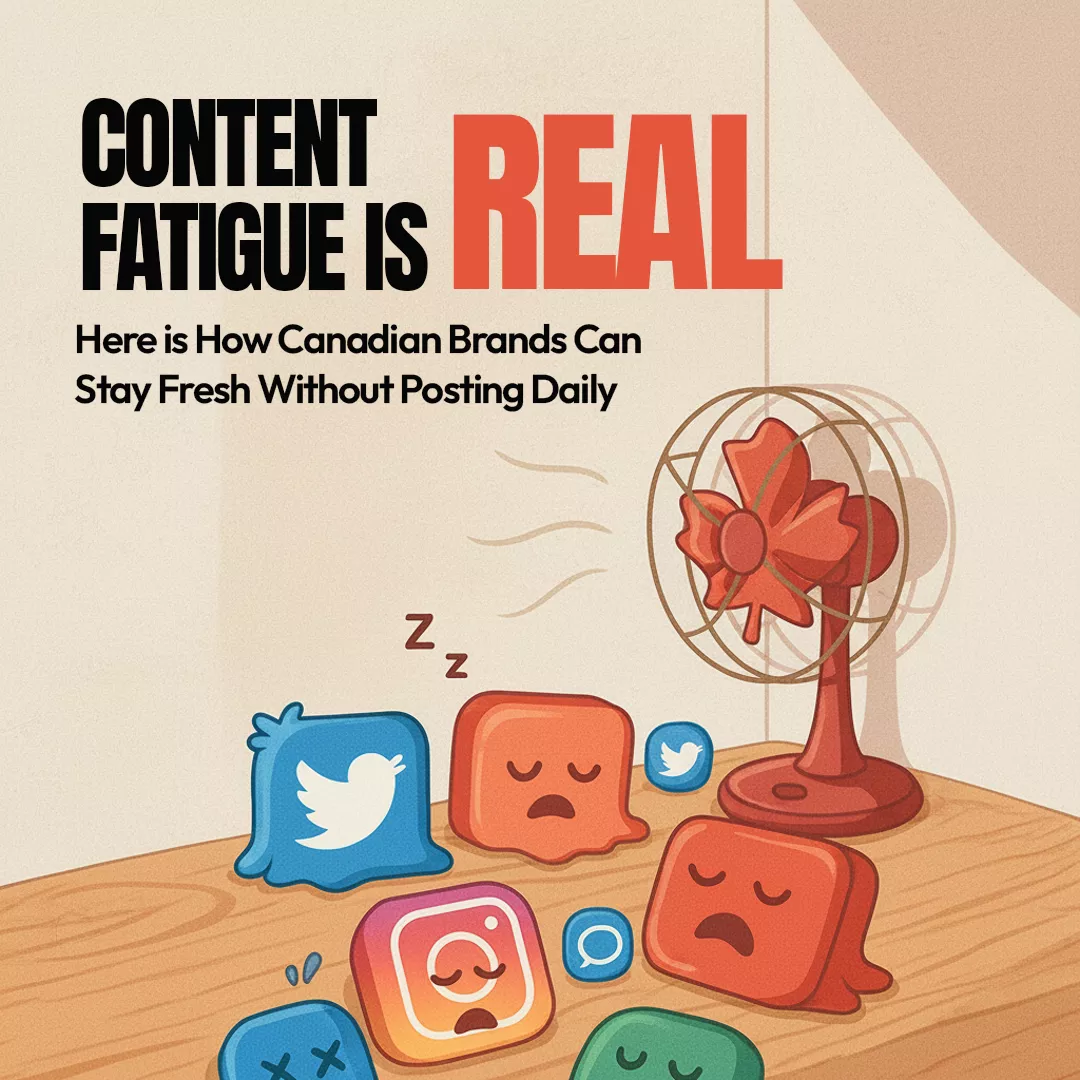
Aron Ahuja December 4, 2025 Content Fatigue is Real. Here

The Canadian Founder’s Guide to Paid Media: How to Spend Less and Scale Faster
Aron Ahuja December 4, 2025 The Canadian Founder’s Guide to

Why Toronto Is North America’s Shopify Capital
Aron Ahuja October 21, 2025 Why Toronto Is North America’s
All You have to do is fill out the form below, and our digital marketing experts will contact you.


